Making complex treatment information easier to navigate.
LITFULO is a treatment for severe alopecia areata. The HCP website needed to communicate efficacy, safety, dosing, and support information within Pfizer’s established digital ecosystem.
I helped shape the site structure, narrative flow, wireframes, and accessibility considerations to help healthcare professionals understand LITFULO’s value and consider it for appropriate AA patients.
01 · The challenge
Helping HCPs find what matters without losing the brand story.
HCPs needed to quickly find information within a large, content-heavy site. The challenge was creating a hierarchy that made priority information easy to locate without minimizing required content or disrupting established Pfizer patterns.
At the same time, the website needed to tell a clear, compelling story about LITFULO—helping healthcare professionals understand its value and consider it for appropriate alopecia areata patients. The experience also needed to work within the PfizerPro design system, which provided the visual language and reusable UI components used across Pfizer brands.
AudienceHealthcare professionals
Core needFast access to relevant treatment information
SystemPfizerPro design system
02 · My role
Shaping the UX from structure through handoff.
My focus was UX design across the site—from information architecture and wireframes to accessibility considerations and design review.
I worked closely with account, copy, strategy, UI design, the brand’s development team, and accessibility specialists. I also participated in client reviews and incorporated feedback as the experience evolved.
Beyond creating wireframes, I reviewed copy and design decisions through a UX and accessibility lens, surfaced limitations within the PfizerPro component library, and helped the team understand how available patterns could support the intended content.
Information architectureSitemap developmentWireframingUX designDesign-system applicationAccessibility review
03 · Understanding the audience
Two HCP mindsets shaped how information needed to work.
Existing research identified two distinct HCP mindsets that informed how we prioritized and structured content.
HCP segment
Leaders
Confident in their treatment approach and more likely to view AA as a serious autoimmune disease that may warrant systemic therapy.
Spend more time learning about AA
Report stronger confidence in current treatment approaches
Respond positively to ritlecitinib
HCP segment
Empathizers
More attuned to the emotional impact of AA and the unmet need for improved efficacy, while less convinced about systemic therapy.
More aware of AA's emotional impact
Spend less time learning about AA
React very positively to ritlecitinib
Design implication
The experience needed to make efficacy and disease seriousness easy to understand while giving HCPs enough context to build confidence in a newer systemic treatment option.
04 · Creating the structure
Building from PfizerPro conventions into a LITFULO-specific experience.
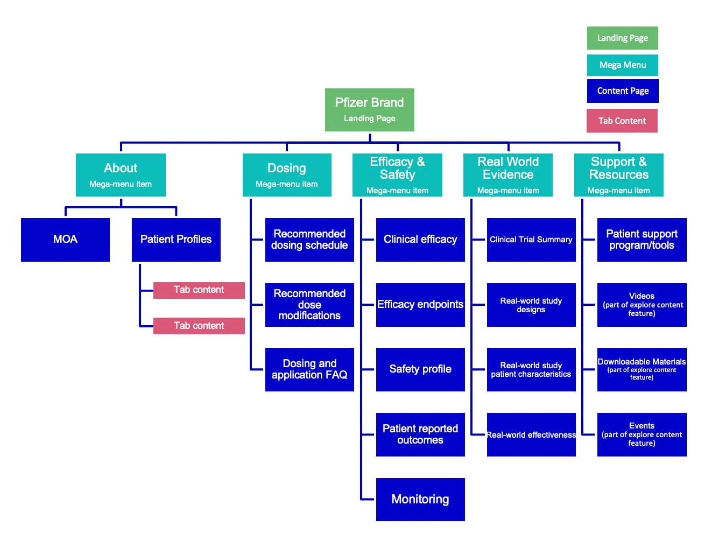
The site began with the standard PfizerPro sitemap framework, which established the global information architecture and platform conventions used across Pfizer brand sites.
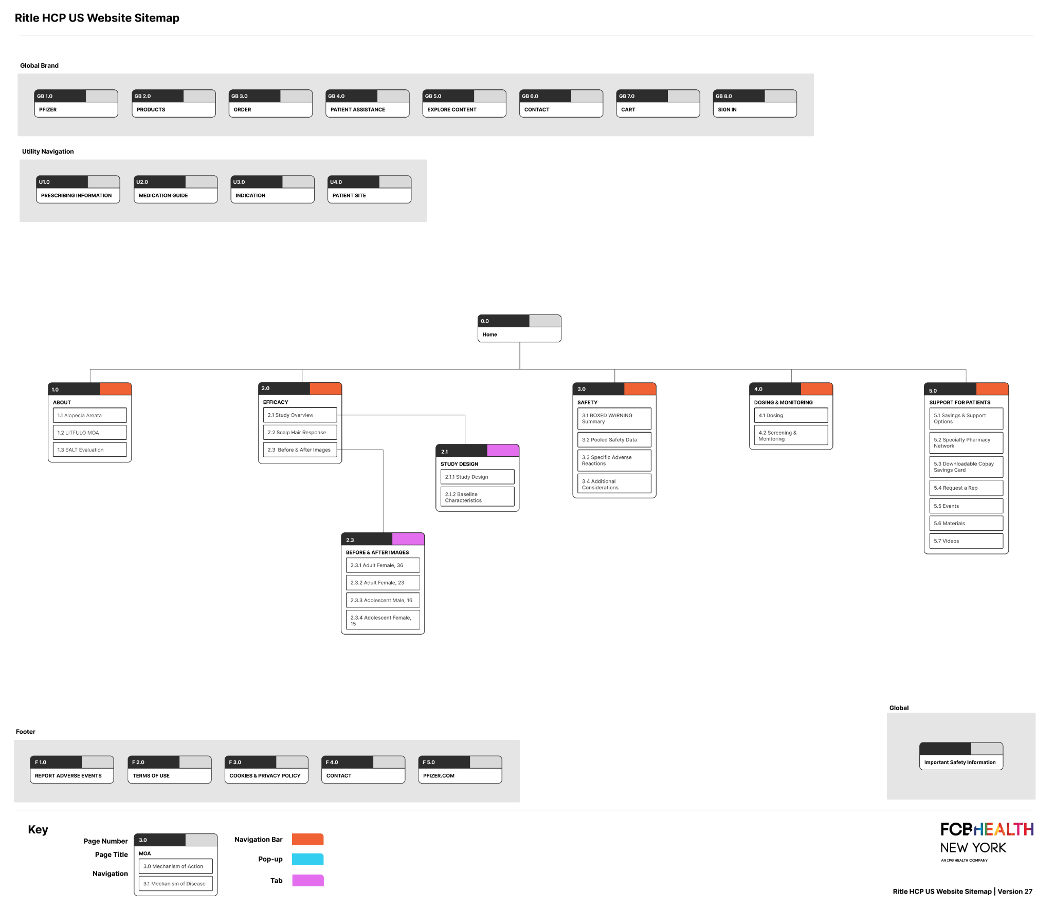
As the LITFULO experience evolved, additional content was developed based on U.S. white paper research and patterns from existing PfizerPro sites. UX worked closely with copy to shape the content structure, refine the narrative flow, and finalize the sitemap.
Clarified the hierarchy
Grouped related treatment information into predictable sections so HCPs could understand where to look before entering individual pages.
Created a flexible structure
Organized content within established PfizerPro conventions while accommodating the needs of the LITFULO brand story.
PfizerPro sitemap framework. The standard structure provided a starting point for organizing the brand experience within existing platform conventions.
Final sitemap. The finalized sitemap reflects the content structure and navigation developed through ongoing collaboration between UX, copy, and the broader team.
05 · Wireframes & design considerations
Applying the content hierarchy within PfizerPro constraints.
Wireframes were created using the PfizerPro design system, which meant working within established components, usage guidelines, and content limits from the start. I focused on selecting patterns that could support dense clinical content while maintaining usability, accessibility, and alignment with platform standards.
Early in the project, I familiarized myself with available components—including their use cases, dos and don’ts, and character limits—and kept the broader team informed of their capabilities and limitations.
Design system
Worked within established PfizerPro components and documented guidelines rather than introducing patterns the platform could not support.
Accessibility
Reviewed wireframes, copy, and color usage through an ADA lens and recommended adjustments where needed.
Regulatory
Selected patterns that could meet pharma requirements while keeping the experience usable and easy to follow.
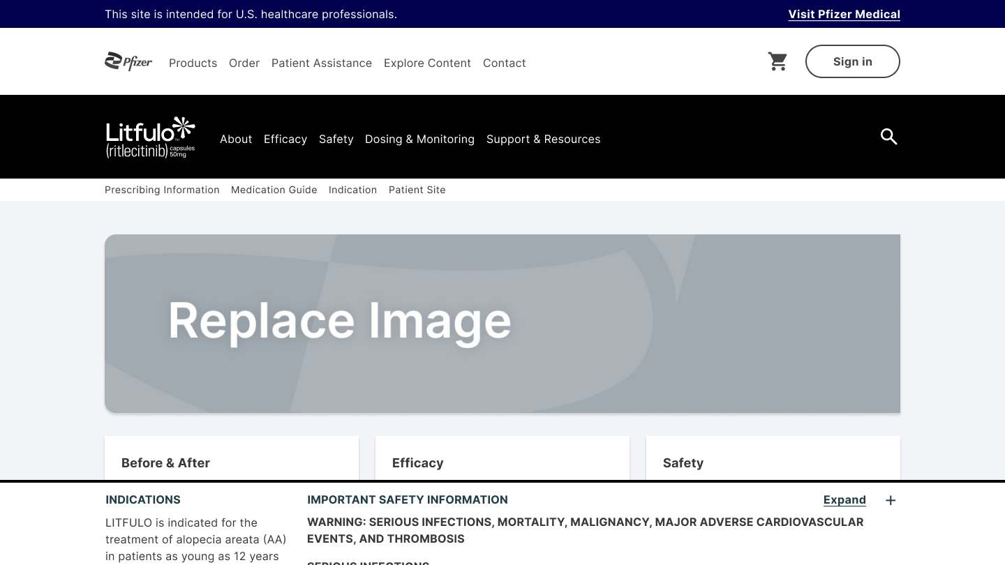
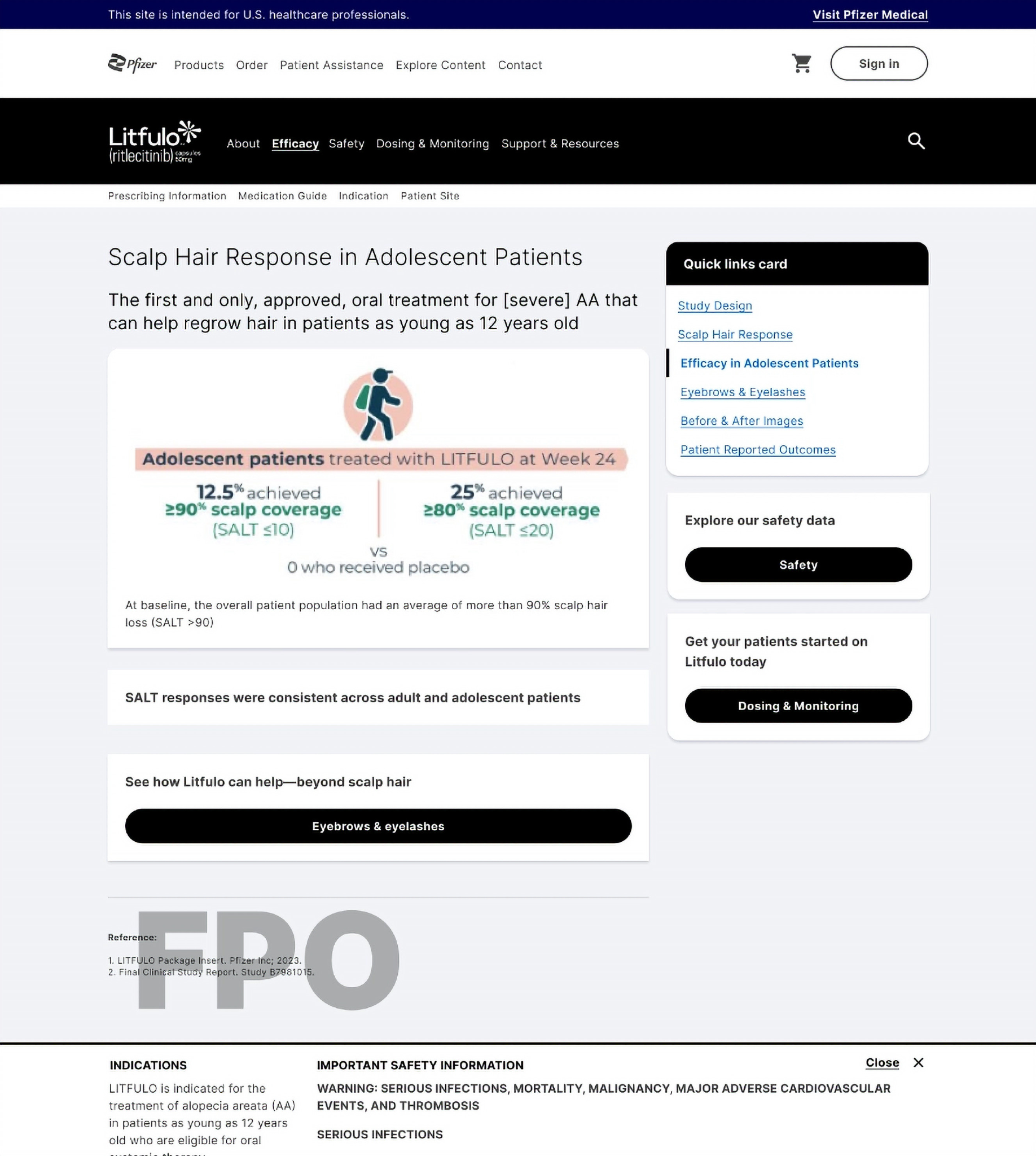
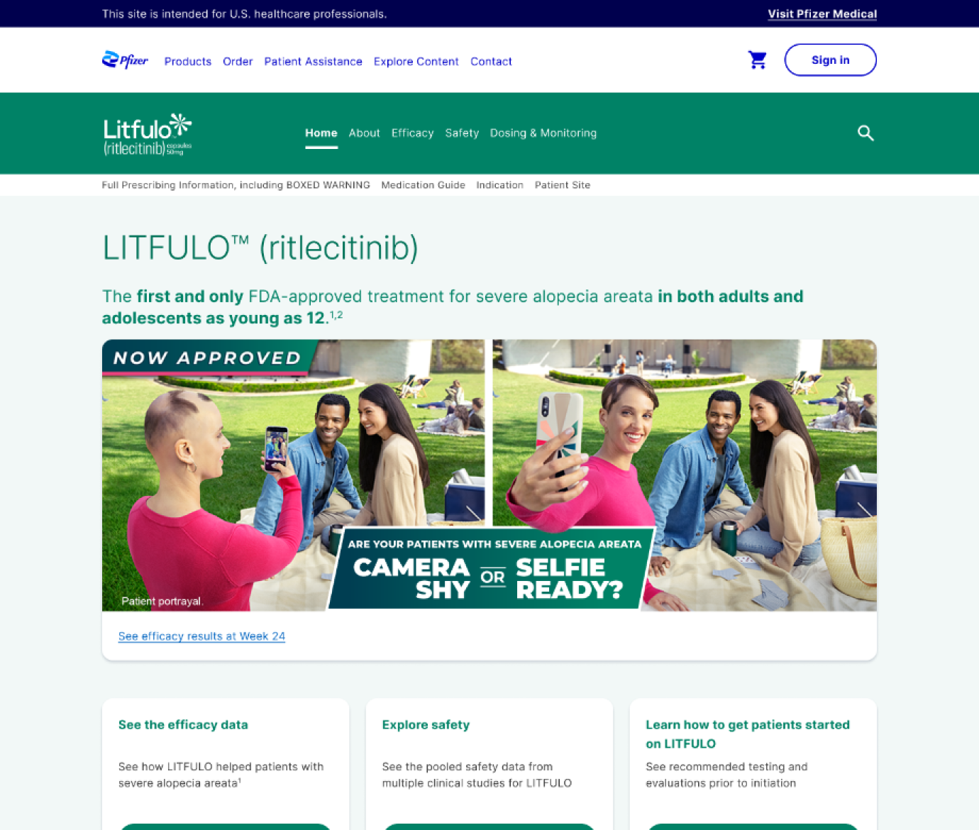
Home page. A layered navigation system following PfizerPro, modular content cards, and persistent ISI.Efficacy page. Quick links, contextual CTAs, and image assets helped break a long efficacy page into clearer paths.
Responsive behavior
The desktop patterns were adapted for smaller screens by stacking content and preserving navigation and hierarchy.
Constraint in practice
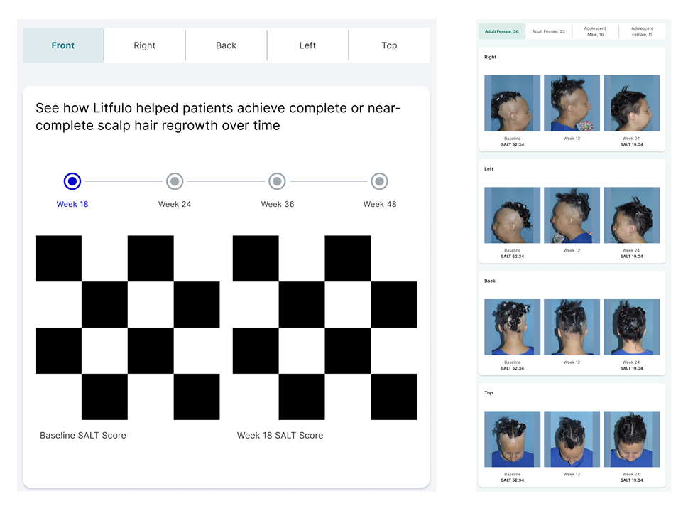
Adapting the before-and-after experience
One challenge was presenting before-and-after photography across multiple patients, viewing angles, and timelines. The design system limited how freely we could structure the interaction, so we adapted existing components instead of introducing a custom pattern. Using tabs, cards, and consolidated image assets, we created a way to accommodate multiple timelines while staying within PfizerPro constraints.
06 · From wireframes to visual design
Carrying the UX intent into full layouts.
Once the UX structure and wireframes were established, the UI designers translated them into full visual layouts using the PfizerPro design system and LITFULO brand direction.
I remained involved through this phase, reviewing layouts from a UX and accessibility perspective, providing feedback on content hierarchy and component use, and collaborating with UI, copy, accessibility, and development as designs moved toward implementation.
07 · Final experience
From wireframes to a live HCP experience.
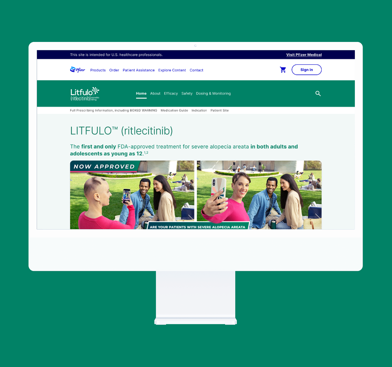
The final site brought the information architecture, clinical content, and PfizerPro components together into a cohesive experience for healthcare professionals.
The full branded LITFULO HCP website launched in August 2023 and continued to evolve through subsequent phases as new content, approvals, and business needs emerged.
Post-launch updates included refining screening and monitoring content, adding and updating resources, replacing existing content with newly approved materials, and making ongoing formatting and experience improvements across the site.
The goal remained consistent: help HCPs find the information they need and support a clearer path to getting appropriate patients started on LITFULO.