They gave because they believed in the museum.
Donors were motivated by the museum’s mission and wanted to help sustain its programs and experiences.
Case study · Website
Redesigning the donation experience around the needs of museum donors.
01 · Project at a glance
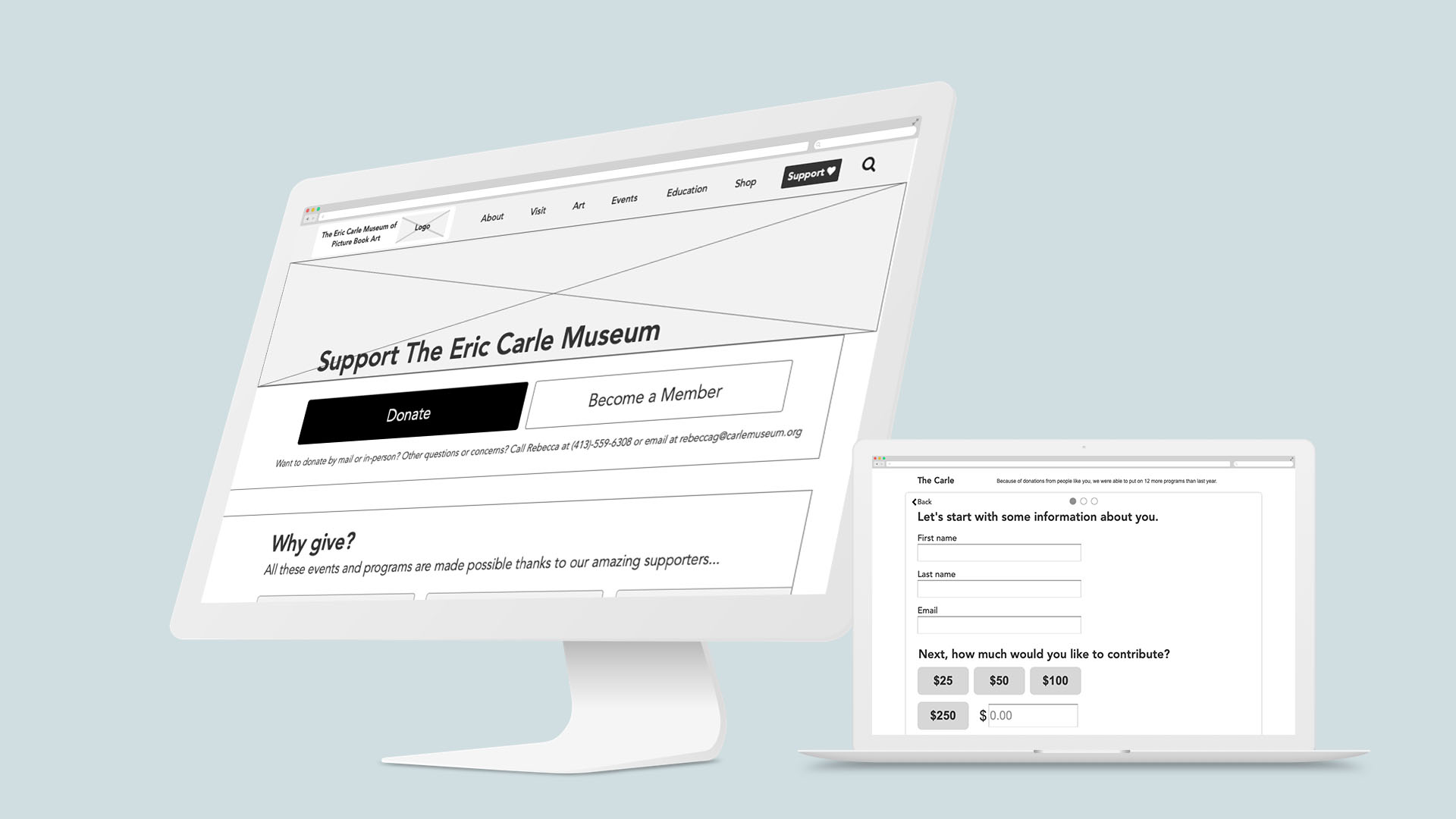
The Eric Carle Museum of Picture Book Art wanted to improve its digital experience for an important audience: donors. Over four weeks, our team researched donor behaviors and motivations, identified gaps in the existing online experience, and explored ways to make supporting the museum feel more personal, transparent, and connected to its mission.
02 · The challenge
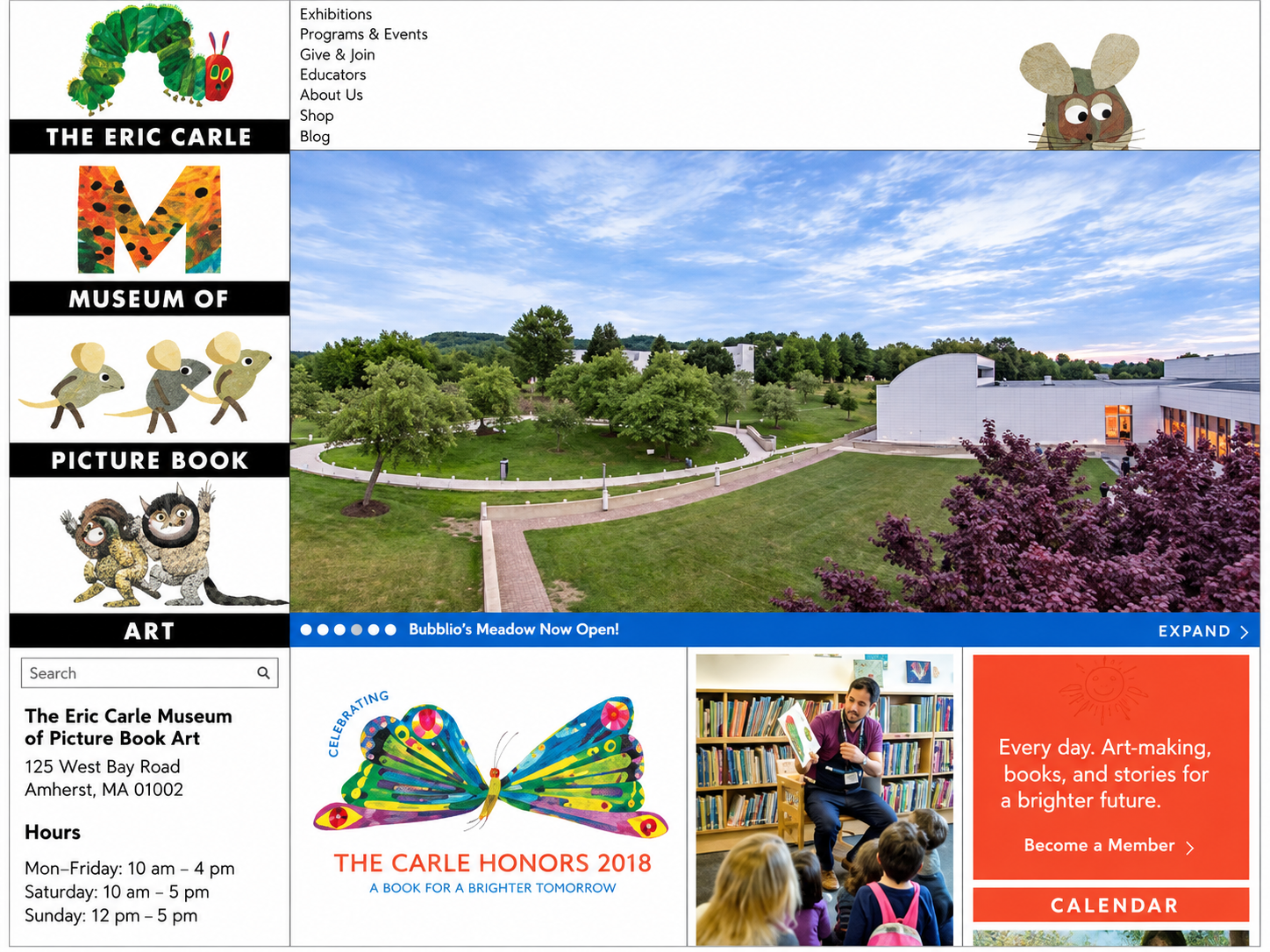
We initially approached the project as a broader museum website redesign, but once our assigned audience shifted to donors, the problem changed. We needed to understand what motivated donors, where the online process created friction, and how the site could better communicate the impact of their support.
03 · My role
As a UX Designer on the team, I contributed across user research, synthesis, concept development, information architecture, wireframing, prototyping, and usability testing. I worked with the team to translate donor needs into a redesigned support and donation experience.
04 · Understanding donors
Research helped us understand why people supported the museum and where the digital experience fell short.
Donors were motivated by the museum’s mission and wanted to help sustain its programs and experiences.
Many participants donated in person or by mail. Those who had donated online described the process as frustrating or impersonal.
Donors cared about the programs they were helping fund and wanted more transparency around how contributions were used.
Source: Eric Carle Museum Director of Development
05 · Defining the donor experience
We used the research to define Carol, an enthusiastic museum supporter who values the museum’s educational mission but wants a more personal and transparent way to contribute.

The enthusiastic museum supporter
Mapping Carol’s experience revealed a sharp contrast between the emotional connection she felt at the museum and the experience of donating online.
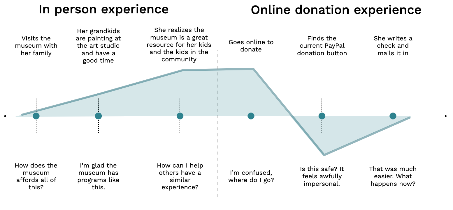
These findings became four principles that guided the concepts that followed.
Connect giving to the people, programs, and experiences donors care about.
Help donors understand how contributions are used.
Make giving feel like an ongoing relationship with the museum rather than a one-time transaction.
Demonstrate what donor support makes possible through programs, stories, and outcomes.
06 · Exploring the experience
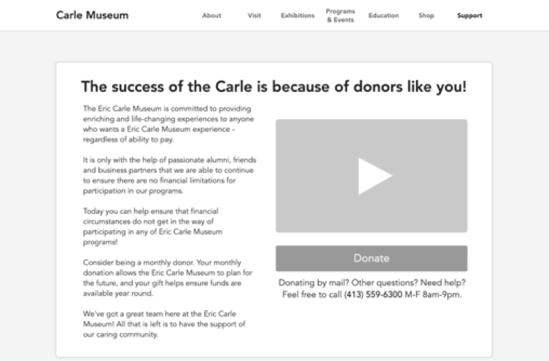
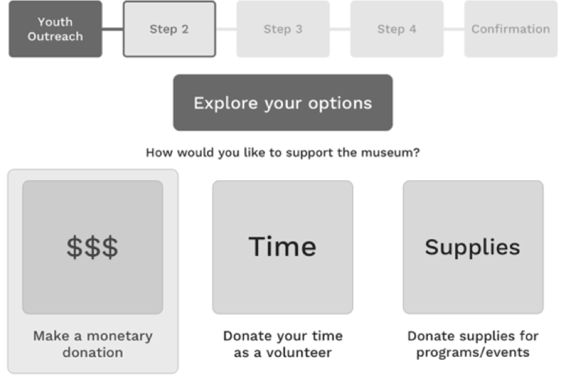
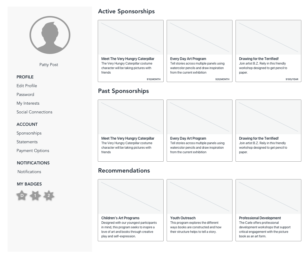
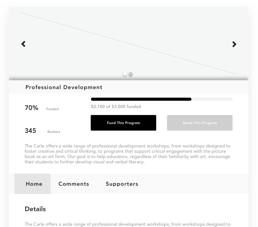
We explored how the support experience could connect donors to the museum’s mission before, during, and after a contribution.
07 · Testing & refinement
We tested whether donors could find the support experience, understand the available ways to contribute, and move through the flow with confidence. Feedback helped us clarify hierarchy and calls to action.
We separated donating from membership and made the primary path easier to recognize without hiding other ways to support the museum.
We brought mission, fundraising context, and supported programs closer to the donation entry point so donors could understand why their support mattered.
We explored sponsorship history, program progress, and contribution visibility to reinforce transparency after a donation was made.
08 · Final experience
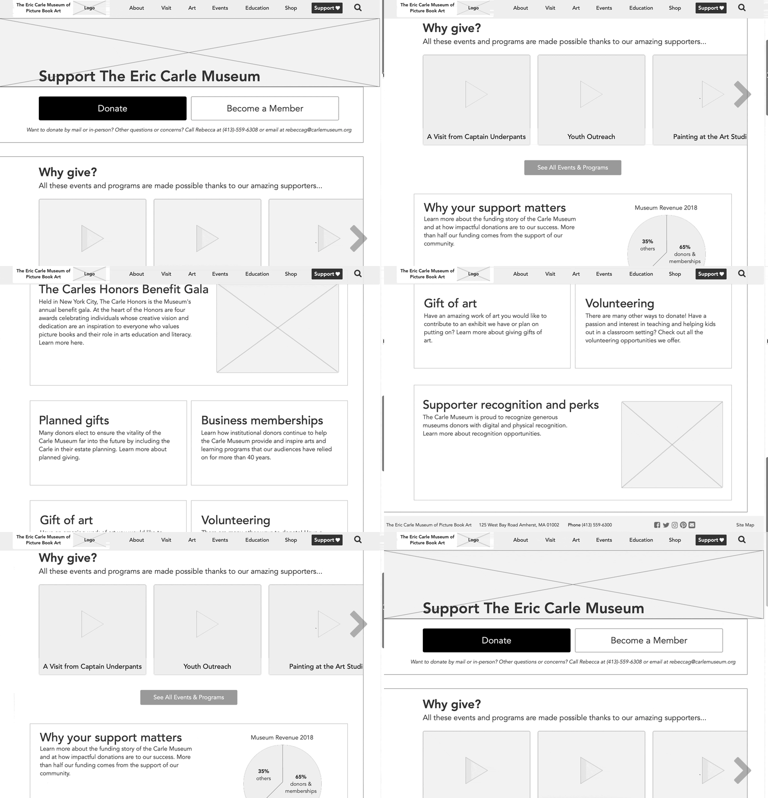
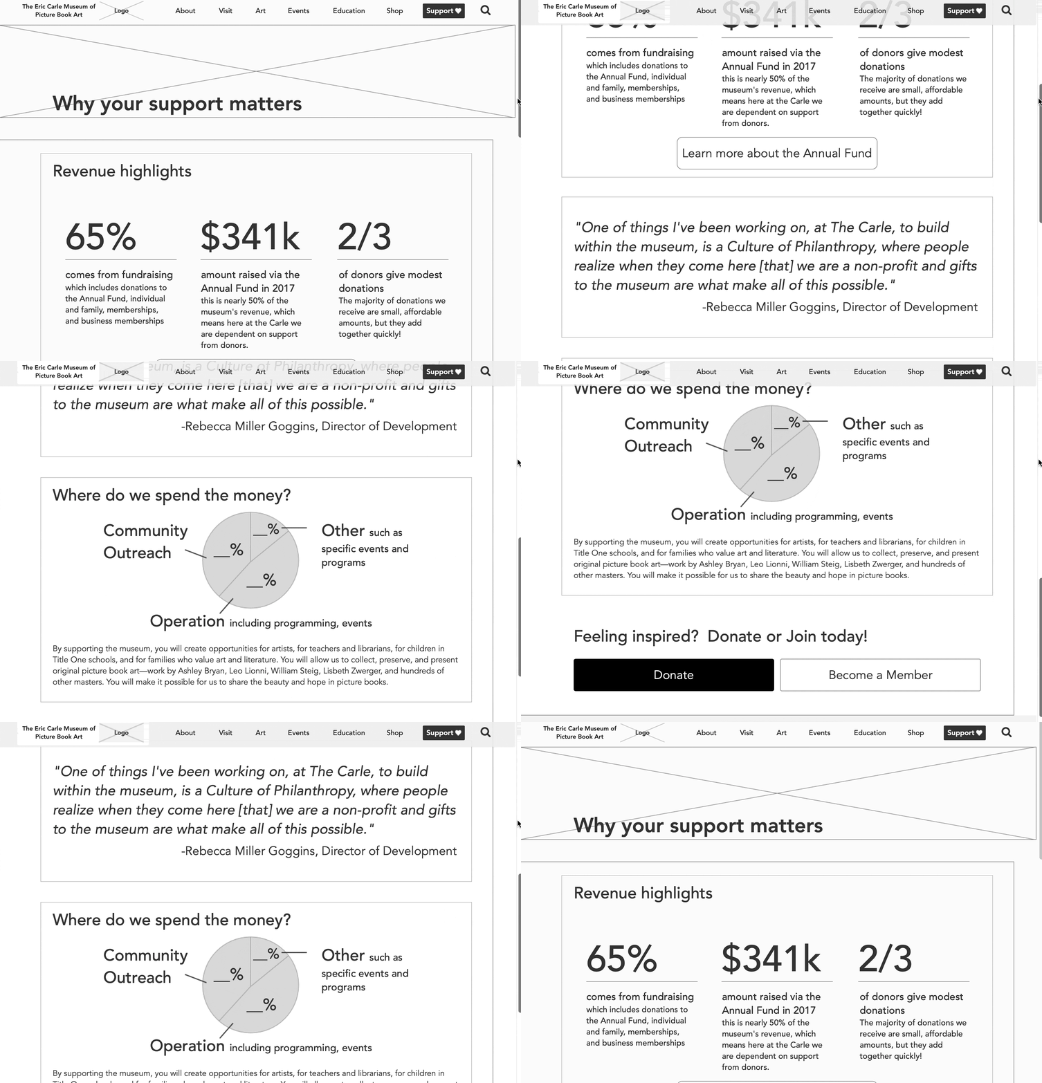
The final prototype brought the strongest ideas together into one experience: explain why support matters, give donors flexible ways to contribute, and create more visibility into the programs their support makes possible.
Prototype walkthrough
The walkthrough shows how the redesigned support and donation experience comes together from entry point through contribution and continued engagement.
09 · High-fidelity concept
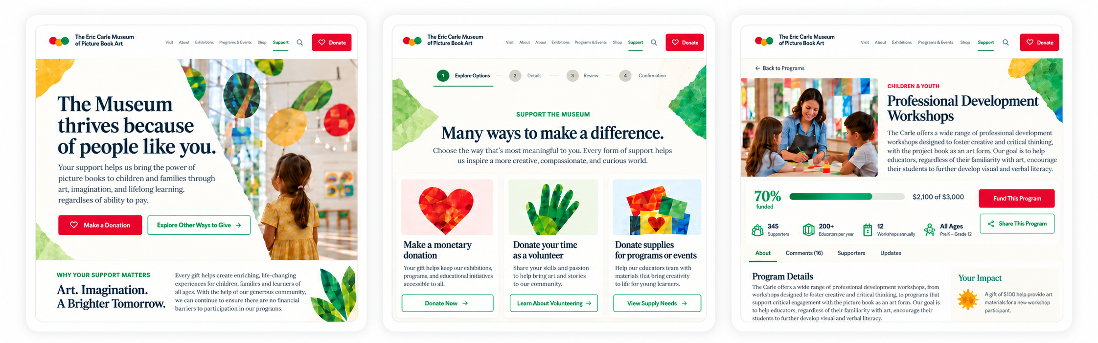
I later explored a high-fidelity visual direction that brought more of the museum’s character into the donor experience while keeping the journey clear and easy to navigate.
10 · Reflection
We began with a broad museum experience, but focusing on donors revealed that the challenge was not simply making a transaction easier. The digital experience needed to reinforce donors’ existing connection to the museum, show the impact of their support, and make giving feel more trustworthy and meaningful.